
Introduction to the Iconic Emblem
Art and sports culture often intersect in fascinating ways, capturing the spirit, passion, and identity of a community. When fans in Kansas City gather to support their beloved NFL franchise, they proudly display a distinct visual symbol that has become synonymous with excellence on the gridiron. Capturing this emblem on paper is a rewarding project for artists, football enthusiasts, and creatives alike. Whether you are sketching in a quiet studio in Missouri or creating spirited fan art during game day tailgate parties near Arrowhead Stadium, mastering this design requires precision, patience, and an understanding of its classic geometric balance.

The visual identity of the Kansas City Chiefs draws heavy inspiration from another legendary franchise, paying homage to the rich sports heritage of the American Midwest. Translating these bold contours and striking colors onto a blank page allows you to appreciate the subtle design choices that make professional sports branding so enduring. This comprehensive guide walks you through the essential tools, preparatory steps, and meticulous drawing techniques needed to render a polished, professional-looking replica of the famous arrowhead insignia.
Gathering Your Materials and Preparing Your Workspace
Essential Drawing Supplies
Before putting pencil to paper, assembling the correct equipment ensures your artwork maintains clean lines and accurate proportions. While digital artists may prefer working on tablets, traditional sketching remains a fantastic tactile experience.
- Graphite Pencils: A standard HB pencil is ideal for initial sketching, while a softer 2B or 4B pencil works well for shading and deepening outlines later.
- Erasers: A kneaded eraser is essential for lifting excess graphite without damaging the paper surface, complemented by a precision eraser for tight corners.
- Paper: Heavyweight sketch paper or Bristol board (at least 80 lb weight) prevents warping, especially if you plan to add ink or markers.
- Inking Pens: Fine-liner pens with archival ink (ranging from 0.1mm to 0.8mm) provide crisp, permanent borders.
- Color Mediums: Vibrant red and bright yellow markers, colored pencils, or acrylic paints are necessary to capture the iconic palette of the National Football League.
Setting Up for Success
A well-lit, organized workspace significantly enhances your drawing accuracy. Position your desk lamp to minimize shadows cast by your hands onto the paper. Tape the corners of your drawing sheet down with low-tack artist tape to keep the paper firmly in place, preventing unintended shifts while you sketch intricate curves and overlapping letterforms.
Step-by-Step Sketching Guide
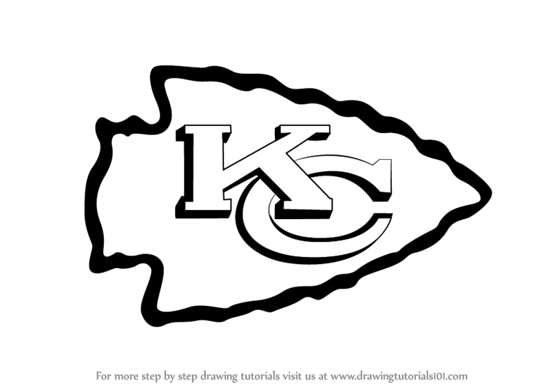
Step 1: Establishing the Underlying Grid and Proportions
Every great drawing begins with a solid structural foundation. The silhouette of the emblem is built around a stylized arrowhead shape pointing toward the upper left quadrant.
- Lightly sketch a large, slanted oval or egg shape as a rough bounding box for your overall composition. This ensures your final drawing has enough breathing room on the page.
- Draw a central diagonal axis line running from the bottom right to the top left. This axis dictates the tilt and aerodynamic feel of the arrowhead.
- Lightly map out where the intersecting letters will sit. Precision in this initial phase prevents awkward proportions once you begin detailing the typography.
Step 2: Outlining the Arrowhead Shape
The outer boundary of the logo features a smooth, sweeping arrowhead encased in a thick white border, which is further outlined by a bold black line.
- Begin drawing the curved, pointed tip at the upper left. The tip should taper gracefully rather than forming a sharp, needle-like point.
- Extend the sweeping edges downward and outward, creating a rounded, shield-like base at the bottom right.
- Draw a parallel inner line following the entire perimeter of the arrowhead to establish the thick white border segment. Keep your pencil strokes whisper-light so you can easily adjust curves as needed.
Step 3: Drafting the Interlocking Letters
The centerpiece of the design consists of two overlapping letters: a prominent ‘K’ positioned slightly behind and intertwined with a bold ‘C’.
- Sketch the vertical spine of the letter ‘K’ along the right-hand side of the interior space.
- Draw the diagonal upper and lower arms of the ‘K’, ensuring they angle dynamically toward the left edge of the arrowhead boundary.
- Form the large, open curve of the letter ‘C’ so that it wraps around the left side of the ‘K’, creating a seamless visual interlocking effect. The negative space between and within the letters must remain balanced and uniform.
Step 4: Refining Outlines and Adding Weight
Once you are satisfied with your light construction lines, it is time to solidify the composition.
- Take a darker pencil or your fine-liner pen to trace over the finalized contours.
- Apply varying line weights: thicker lines along the outer perimeter give the logo a bold, three-dimensional pop, while thinner interior lines keep the typography crisp and legible.
- Carefully erase all remaining construction lines, grid marks, and stray graphite smudges using your kneaded eraser.
Applying Color, Shading, and Final Polish
The Power of the Palette
Color accuracy is paramount when rendering professional sports insignia. The visual impact relies heavily on two primary hues: a vibrant, saturated red and a brilliant sunshine yellow.
- The Red Field: Fill in the main body of the arrowhead and the interior spaces of the letters with a rich, bold red. If you are using markers, use smooth, overlapping strokes in a single direction to avoid streaking.
- The Yellow Accents: The inner borders and specific structural highlights utilize a bright, energetic yellow that contrasts sharply against the deep red background. Take your time coloring these narrow channels to keep edges sharp and clean.
- The Crisp White Border: Leave the designated border spaces completely uncolored to maintain the stark, high-contrast separation that defines the official branding.
Advanced Rendering Techniques for Depth
To elevate your flat drawing into a dynamic piece of sports art, consider incorporating subtle shading and texture.
- Drop Shadows: Add a soft gray shadow underneath the right and bottom edges of the logo to give it a floating, three-dimensional appearance on the page.
- Specular Highlights: Use a white gel pen to add subtle light reflections along the curved surfaces of the red and yellow fields, simulating a glossy, metallic, or enamel badge finish.
- Digital Touch-Ups: If you scanned your hand-drawn sketch into a computer design program, utilize vector tools to smooth out bezier curves and achieve absolute symmetry.

Conclusion and Displaying Your Artwork
Creating a faithful rendition of this legendary football emblem is a rewarding exercise in proportion, line work, and color theory. Whether displayed in a home office, a sports-themed entertainment room, or shared within online creative communities based in Overland Park, your finished piece reflects both artistic dedication and team spirit. Practice the foundational shapes regularly, experiment with different mediums—from watercolor washes to digital vectors—and continue refining your illustration skills to bring your favorite sports iconography vividly to life.
LifeOutOfTheBox is a participant in the Amazon Services LLC Associates Program, an affiliate advertising program designed to provide a means for sites to earn advertising fees by advertising and linking to Amazon.com. Amazon, the Amazon logo, AmazonSupply, and the AmazonSupply logo are trademarks of Amazon.com, Inc. or its affiliates. As an Amazon Associate we earn affiliate commissions from qualifying purchases.