
When travelers wander through the historic streets of New York City, they often find themselves drawn to the intellectual pulse of the city. Among the many cultural icons that define the atmosphere of this metropolis, the typographic identity of the New York Times stands as a beacon of authority and tradition. For the observant visitor, the specific design choices behind this world-renowned publication offer a fascinating intersection of history, art, and local culture.
The Typographic Legacy of a Media Titan
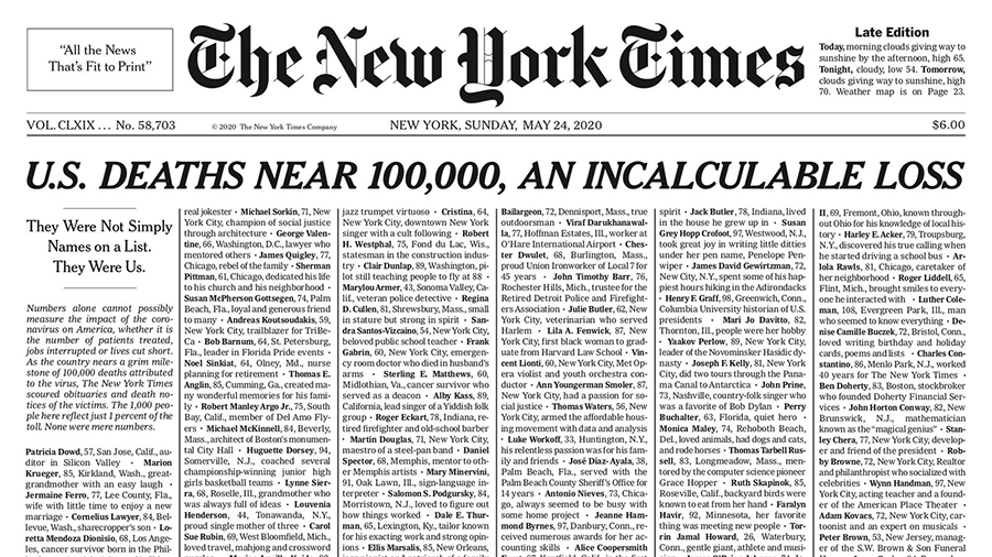
The visual identity of this institution is deeply rooted in its history. Visitors walking past the New York Times Building might recognize the iconic masthead that has graced the front page for decades. The font used for the nameplate—that distinctive, intricate blackletter script—is a custom-drawn classic that has been refined over time. However, the internal body copy and headlines are where the real typographical story lies for design enthusiasts exploring the media landscape of Manhattan.

The Evolution of Modern Typefaces
For years, the publication relied on a suite of fonts that balanced readability with a sense of gravity. The modern reader—and the design-conscious traveler—will notice the shift toward high-legibility typefaces that perform equally well on physical newsprint and on mobile devices. The primary typeface used for headlines and various editorial features is known as Cheltenham. This serif font has become synonymous with the publication’s voice, providing a structured, authoritative aesthetic that complements the fast-paced, ever-changing environment of New York.
The Role of Custom Design
Beyond standard industry fonts, the organization invests heavily in proprietary typefaces. Designers have meticulously crafted bespoke versions of classic styles to ensure that when you are reading an article while sipping coffee in a bustling Brooklyn cafe, the experience is seamless. These custom iterations allow the publication to maintain a unique visual footprint that differentiates it from other global newspapers found in places like London or Paris.
Typography as a Cultural Landmark
In the realm of tourism, we often focus on architecture and monuments, yet the visual language of a city’s media is just as much a “landmark” as a bridge or a skyscraper. When you visit a cultural center, you are absorbing the local design vernacular. The font of the New York Times reflects the rigid yet innovative spirit of the United States. It is a marriage of old-world European roots and modern American pragmatism.
Serif vs. Sans Serif in Print
The intentional choice of serif fonts in the publication’s design serves a specific purpose. Serifs—the small decorative strokes at the ends of letters—are historically preferred for long-form print media because they guide the reader’s eye across the page. For a tourist visiting the Public Library or browsing a local kiosk, seeing these letters in print feels like a continuation of the city’s academic tradition. It transforms the act of reading into an experience of connection with the history of New England and the surrounding cultural regions.
Digital Readability in the 21st Century
As technology evolves, so does the medium. The transition to digital platforms has required a sophisticated approach to typography. The New York Times utilizes a range of sans-serif fonts for its digital interface, ensuring that clarity is maintained on screens of all sizes. For the traveler on the go, navigating the website via a smartphone while visiting landmarks like the Empire State Building is a testament to how traditional design can successfully adapt to modern tools.
The Artistic Influence on Design Choices
Design is not merely about picking a font; it is about conveying a message of reliability and depth. The editorial team understands that their typography acts as a subconscious anchor for the reader. When you see those distinct character sets, you immediately recognize the brand identity. This level of visual consistency is something that many premium travel brands, such as those found in Miami or Los Angeles, strive to emulate in their own marketing materials.
Aesthetics of the Print Edition
There is a specific tactile pleasure to the print edition of the New York Times. The spacing, the kerning, and the weight of the ink on paper contribute to a sensory experience that digital media struggles to replicate. For the savvy traveler, picking up a physical copy at a transit hub is a classic ritual. It allows one to immerse themselves in the deep, thoughtful journalism of the city while perhaps waiting for a train to head toward the Hudson Valley.
Influencing Modern Brand Identities
The design philosophy of the New York Times has served as a benchmark for aesthetic standards. Many boutique establishments, including historic inns and restaurants in Charleston or San Francisco, often look toward established editorial designs when crafting their own brand identities. By utilizing classic serifs or clean, modern typography, they tap into the same sense of trust and permanence that the newspaper has cultivated for over a century.
Connecting Through Visual Identity
Ultimately, understanding the font choices of the New York Times allows the curious observer to better appreciate the design layers that make New York City a world capital of style and media. Whether you are looking at the architecture of the Chrysler Building or reading the latest analysis in a quiet corner of a Central Park bench, design is everywhere.
The Lasting Impact of Consistent Design
When a brand stays true to its visual roots—like the New York Times has with its iconic masthead and disciplined body text—it creates a sense of reliability. For the global traveler, recognizing these small details can offer a sense of grounding. Even in an ever-shifting world where cities like Tokyo or Berlin are constantly reinventing themselves, the endurance of specific design elements provides a comforting continuity.

A Final Thought for the Design-Savvy Traveler
The next time you find yourself navigating the busy avenues of New York City, take a moment to look at the typography surrounding you. From the signage in the Subway to the headline of the New York Times, every font tells a story. By paying attention to these details, you elevate your travel experience from simply visiting a location to truly understanding the cultural and aesthetic fabric that binds it together. The legacy of their typographic choices remains one of the most subtle, yet profound, ways the publication continues to define the spirit of the United States.
LifeOutOfTheBox is a participant in the Amazon Services LLC Associates Program, an affiliate advertising program designed to provide a means for sites to earn advertising fees by advertising and linking to Amazon.com. Amazon, the Amazon logo, AmazonSupply, and the AmazonSupply logo are trademarks of Amazon.com, Inc. or its affiliates. As an Amazon Associate we earn affiliate commissions from qualifying purchases.