
When travelers wander the bustling streets of New York City, they often find themselves immersed in a visual landscape defined by iconic branding. From the glowing signs of Times Square to the historic masthead of the city’s most famous newspaper, typography plays an essential role in how we perceive the identity of this legendary metropolis. Just as the architecture of the Empire State Building defines the skyline, the typeface used by The New York Times defines the intellectual atmosphere of the city.
For those exploring the cultural landmarks of Manhattan, understanding the aesthetic heritage of local institutions adds a layer of depth to the travel experience. The font you see on the front page of the paper is more than just ink on newsprint; it is a piece of history that speaks to the endurance of print media in a digital age.

The History and Evolution of the Famous Serif
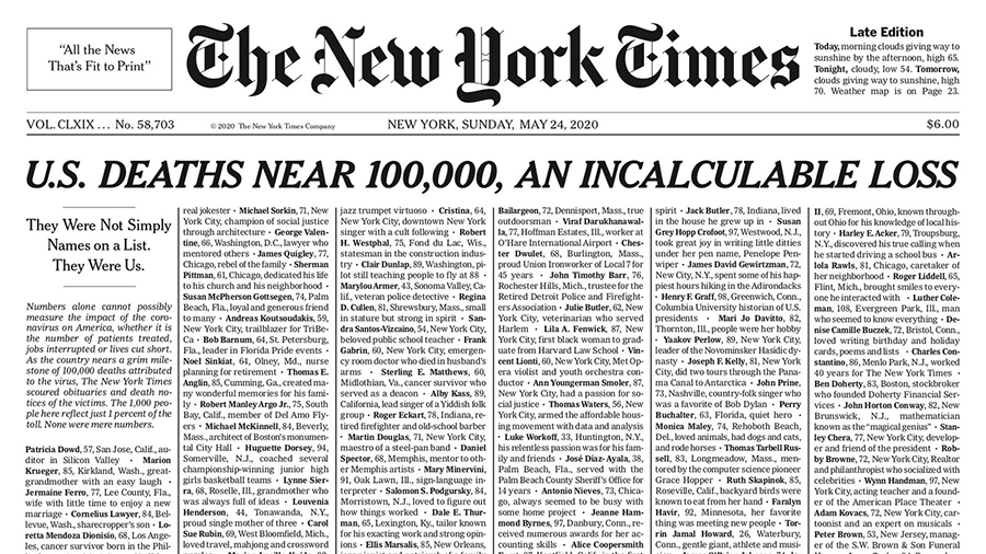
The typeface synonymous with The New York Times is officially known as “Cheltenham.” While many assume it is a custom font created specifically for the publication, its roots are far more complex and tied to the historical trends of typography in the early 20th century.
The Origins of Cheltenham
Designed originally by Bertram Goodhue and Ingalls Kimball in 1896, the Cheltenham typeface was intended to be a highly legible yet elegant solution for print media. When the newspaper adopted it, they modified it to create a bespoke version known as “New York Times Cheltenham.” This custom adaptation features tighter tracking and specific stylistic tweaks that allow it to remain readable even when condensed into the narrow columns of a traditional broadsheet.
Why It Matters to the City’s Identity
Walking past the New York Public Library, a visitor can appreciate the connection between the printed word and the stone-carved typography of the city. The newspaper’s choice of font reflects the conservative, authoritative, and stable nature of the institution itself. For travelers interested in the history of United States publishing, the typeface serves as a gateway into the era when The New York Times became the definitive voice of the American establishment.
Typography as a Landmark of Cultural Tourism
Travelers often overlook the subtle cues that make a city feel authentic. Just as the Guggenheim Museum uses a specific architectural style to signify modern art, newspapers use fonts to signify their editorial stance. In New York, the ubiquitous sight of that sharp, serif-laden font reminds residents and visitors alike that they are in the center of global discourse.
Decoding the Style
The typeface belongs to the “old style” serif category. Unlike the sans-serif fonts used by modern tech startups or global chains found throughout Midtown Manhattan, this serif font relies on the classic strokes of human calligraphy. Each letter carries a weight that feels grounded in history. When you pick up a copy of the paper at a corner stand near Grand Central Terminal, you are holding a physical manifestation of a design philosophy that prioritizes tradition over the fleeting nature of modern digital design.

Influence on Local Aesthetics
This font is not confined to the pages of the paper. It has influenced the signage of prestigious cultural institutions throughout New York State and beyond. The aesthetic of “New York Times Cheltenham” has become a shorthand for sophistication. Walk through the halls of the Metropolitan Museum of Art or browse the curated shops of SoHo, and you will often find similar serif typefaces used in branding for high-end galleries and historic bookstores. It is a visual language of prestige that tells the tourist, “You are in a place where history is curated with care.”
Identifying Design Trends Across Global Cities
While the newspaper font is a New York staple, typography is a global element of the tourism experience. Just as one might visit London to see the iconic Johnston typeface on the Underground signage, a trip to Paris involves observing the Art Nouveau typography found on the historic Paris Metro entrances.
Comparing Media Typefaces
When we compare the New York paper’s font to other iconic designs, we begin to see how font choices shape the “brand” of a destination. The bold, stark lettering of The Washington Post conveys a different sense of urgency and political weight compared to the traditional, academic dignity of the font used in the Big Apple. For the astute traveler, noticing these differences is part of the joy of engaging with local culture.
The Impact of Print Media on Architecture
The connection between typography and the built environment is undeniable. Architects in Brooklyn frequently pay homage to the classic serif fonts of the early 20th century when designing facades for restored industrial buildings or boutique hotels. By incorporating elements of classic typography into the steel-and-glass structures of modern developments, these projects bridge the gap between the past and the present. When you stay at a luxury loft near the Brooklyn Bridge, pay attention to the signage; you will likely find that the typography draws inspiration from the same historical reservoirs that birthed the newspaper’s famous font.
The Future of Traditional Design in Modern Travel
As we move further into a digital-first world, the presence of traditional fonts like Cheltenham becomes even more significant. They serve as “anchors” in an increasingly fluid world. Whether you are navigating the Statue of Liberty or sitting in a café in Greenwich Village, the visual heritage of the city is what distinguishes it from a generic global travel destination.
Preserving Heritage in a Digital Age
The decision by The New York Times to maintain its traditional typeface, even as its digital platform evolves, is a testament to the power of branding. It signals to the world that while technology changes, the core values—clarity, authority, and historical continuity—remain the same. Travelers who appreciate the nuance of this design choice are often the same travelers who seek out historic hotels in Europe or preserve the authenticity of local food scenes in Asia.
A Traveler’s Perspective on Typography
Next time you visit a major cultural hub, look beyond the main tourist attractions. Take a moment to notice the fonts on the historic markers, the local newspapers, and the building plaques. By doing so, you engage with the city on a deeper level. You are no longer just a passive observer moving through Central Park; you are an active reader of the city’s visual narrative.
The New York Times font is a reminder that even in a city of constant change, there is space for the enduring beauty of traditional design. It connects the reader to a legacy of journalism, the writer to a tradition of craftsmanship, and the traveler to the soul of the city itself. Whether printed on a broadsheet or projected on a digital screen, the typeface remains a cornerstone of the New York experience—a quiet, serifed guardian of the city’s history.
LifeOutOfTheBox is a participant in the Amazon Services LLC Associates Program, an affiliate advertising program designed to provide a means for sites to earn advertising fees by advertising and linking to Amazon.com. Amazon, the Amazon logo, AmazonSupply, and the AmazonSupply logo are trademarks of Amazon.com, Inc. or its affiliates. As an Amazon Associate we earn affiliate commissions from qualifying purchases.