
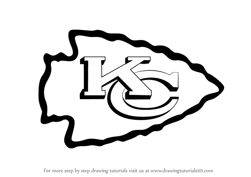
The iconic logo of the Kansas City Chiefs is instantly recognizable to sports fans worldwide. This striking emblem, featuring a stylized arrowhead with a prominent “KC” inside, has become synonymous with the team’s rich history and thrilling performances. While its design appears simple, capturing its essence requires attention to detail and understanding of its proportions. This guide will walk you through the process of drawing the Kansas City Chiefs logo, breaking it down into manageable steps, suitable for aspiring artists and devoted fans alike.
Understanding the Logo’s Elements
Before putting pencil to paper, it’s beneficial to deconstruct the logo into its core components. This approach simplifies the drawing process and ensures accuracy. The primary elements are:

- The Arrowhead: This is the foundational shape, a dynamic, pointed form that conveys speed and direction. It’s not a perfect geometric shape but rather a slightly irregular, elongated diamond with a sharp point.
- The “KC” Monogram: Nestled within the arrowhead is the distinctive “KC” lettering. The letters are bold and slightly stylized to fit harmoniously within the confines of the arrowhead.
- The Color Scheme: While this guide focuses on the drawing process, understanding the iconic red and gold colors is crucial for a complete representation. The arrowhead is typically a vibrant red, and the “KC” is a bold gold.
The Arrowhead Shape
The arrowhead is the most prominent feature and sets the stage for the entire logo. It’s characterized by:
- A Blunt Top: Unlike a sharply pointed arrow, the top of the arrowhead is somewhat rounded or flattened.
- Tapering Sides: The sides sweep inwards gracefully, creating a sense of movement.
- A Sharp Point: The bottom culminates in a distinct, sharp point.
The “KC” Monogram
The letters “K” and “C” are designed to interlock and fill the space within the arrowhead.
- The “K”: The vertical stroke of the “K” is centered, with the diagonal strokes extending outwards. The angle and length of these strokes are critical for its placement within the arrowhead.
- The “C”: The “C” forms the outer boundary on the right side of the monogram, curving inwards towards the “K.”
Step-by-Step Drawing Guide
This section will guide you through drawing the Kansas City Chiefs logo, starting with the basic outline and progressing to the finer details.
Step 1: Sketching the Basic Arrowhead Outline
Begin by lightly sketching the overall shape of the arrowhead. Imagine an elongated diamond.
- Top Horizontal Line: Draw a short, slightly curved horizontal line to represent the top of the arrowhead. This line should not be perfectly straight.
- Side Curves: From the ends of this horizontal line, draw two sweeping curves that angle downwards and inwards. These lines should gradually taper towards the bottom.
- Bottom Point: Connect the two tapering side curves with a sharp, downward-pointing angle to form the tip of the arrowhead.
At this stage, the shape should resemble a rounded-off diamond pointing downwards. Don’t worry about perfect symmetry; the official logo has a hand-drawn quality.
Step 2: Dividing the Arrowhead for the Monogram
Now, you need to divide the arrowhead to accurately place the “KC” monogram.
- Vertical Guideline: Lightly draw a vertical line down the center of the arrowhead. This line will help you center the “K” and ensure the “C” is positioned correctly. This line should extend from the top edge to the bottom point.
- Horizontal Guideline: Draw a horizontal line that intersects the vertical guideline, roughly about two-thirds of the way down from the top. This line will help position the letters vertically.
Step 3: Drawing the “K”
The “K” is positioned slightly to the left of the center.
- Vertical Stem: Draw the main vertical stem of the “K” along the left side of the central vertical guideline. It should extend from just below the top edge of the arrowhead to a point above the horizontal guideline.
- Diagonal Strokes: From the middle of the vertical stem, draw two diagonal strokes extending outwards. The upper diagonal stroke should angle upwards and to the right, while the lower diagonal stroke angles downwards and to the right. Ensure these strokes are bold and of consistent thickness. The ends of these strokes should nearly touch the right boundary of the arrowhead.
Step 4: Drawing the “C”
The “C” will occupy the space to the right of the “K.”
- Outer Curve: Start by drawing the outer curve of the “C” to the right of the vertical stem of the “K.” This curve should follow the contour of the arrowhead’s right side.
- Inner Curve: Draw an inner curve parallel to the outer curve, creating the thickness of the “C.” This inner curve should extend from near the top of the “K” and curve around to meet the bottom of the “K”‘s lower diagonal stroke. The open end of the “C” should align with the inner space between the “K”‘s diagonal strokes.
Ensure the “K” and “C” are bold and fill the designated space within the arrowhead without touching the outer edges of the arrowhead itself, except for the points where they are intended to align.
Step 5: Refining the Shapes and Adding Detail
Once the basic structure of the “KC” within the arrowhead is established, it’s time to refine the shapes.
- Thicken Lines: Go over your sketched lines, making them bolder and more defined. The official logo has thick, impactful lines.
- Adjust Proportions: Compare your drawing to an actual image of the Kansas City Chiefs logo. Make any necessary adjustments to the proportions of the arrowhead or the letters. Pay attention to the curves and angles.
- Smooth Transitions: Ensure the transitions between the straight and curved lines are smooth. For instance, the top of the arrowhead should blend smoothly into the side curves.
- Erase Guidelines: Once you are satisfied with the main shapes, carefully erase all the preliminary guidelines and construction lines.
Step 6: Final Touches and Inking (Optional)
For a polished look, you can choose to ink your drawing.
- Outline: Use a fine-tip black marker or pen to go over your final pencil lines.
- Add Color (Optional): If you wish to add color, use vibrant red for the arrowhead and a bright gold or yellow for the “KC” monogram. The contrast between these colors is a key aspect of the logo’s visual appeal.
Tips for a Professional-Looking Logo
Achieving a professional look for your drawing involves more than just following steps; it requires attention to certain artistic principles.
Proportional Accuracy
The key to a recognizable logo is its proportions. Take time to observe how the “KC” fits within the arrowhead. The width of the letters, their height, and their placement are all crucial. Many successful drawings stem from carefully measuring and comparing against reference images.
Line Weight Consistency
The boldness of the lines is a defining characteristic of the Kansas City Chiefs logo. Ensure that the thickness of your lines is consistent throughout, both for the arrowhead and the letters. This consistency creates a strong, unified design.
Smooth Curves and Sharp Angles
The logo masterfully combines smooth, sweeping curves with sharp, decisive angles. Practice drawing these elements fluidly. The top of the arrowhead should feel less sharp than its point, and the curves of the “C” should be elegant and flowing.

Practice and Patience
Like any artistic skill, drawing the Kansas City Chiefs logo improves with practice. Don’t be discouraged if your first attempt isn’t perfect. The more you draw it, the more familiar you will become with its nuances, and the more accurate and confident your drawings will become.
Drawing the Kansas City Chiefs logo is a rewarding exercise for any fan or art enthusiast. By breaking down the design into its fundamental shapes and following a structured approach, you can confidently replicate this iconic emblem. Whether for personal projects, fan art, or simply as a creative endeavor, mastering this drawing technique allows you to connect with the spirit of the team in a unique and tangible way.
LifeOutOfTheBox is a participant in the Amazon Services LLC Associates Program, an affiliate advertising program designed to provide a means for sites to earn advertising fees by advertising and linking to Amazon.com. Amazon, the Amazon logo, AmazonSupply, and the AmazonSupply logo are trademarks of Amazon.com, Inc. or its affiliates. As an Amazon Associate we earn affiliate commissions from qualifying purchases.