
The Iconic Palette of Miami’s Marine Icon
The Miami Dolphins are more than just a professional American football team; they are a vibrant symbol of Miami, a city renowned for its energetic spirit, sun-drenched beaches, and distinctive cultural tapestry. The team’s identity is deeply interwoven with its visual representation, and at the heart of this identity lie its signature colors. These hues are not merely aesthetic choices; they evoke a sense of place, embody the team’s competitive drive, and have become instantly recognizable identifiers for fans worldwide. Understanding the origins and significance of the Miami Dolphins colors provides a deeper appreciation for the team’s legacy and its connection to the South Florida landscape.

A Splash of Aqua and Orange: The Primary Hues
The primary colors that define the Miami Dolphins are aqua and orange. These colors were chosen at the team’s inception in 1966, a deliberate decision by owner Joe Robbie and his partners to reflect the environment and spirit of South Florida.
Aqua: The Essence of the Tropics
Aqua, a shade that leans towards a vibrant turquoise or teal, is perhaps the most distinctive color associated with the Miami Dolphins. This color immediately conjures images of the crystal-clear, turquoise waters that fringe the Miami coastline. The Atlantic Ocean, with its shallow, sunlit expanses, is a defining feature of the region, and aqua perfectly captures its shimmering, refreshing quality. It speaks to the natural beauty, the relaxed yet vibrant atmosphere, and the inherent allure of a tropical paradise. On the field, aqua symbolizes the fluidity, agility, and speed that fans associate with the graceful movements of the dolphin, the team’s namesake. It’s a color that suggests depth and serenity, yet also the dynamic energy of the ocean currents. Over the decades, the specific shade of aqua has seen subtle variations, but its core essence as the team’s primary identifier has remained constant. It’s a color that evokes a sense of pride and belonging for anyone who has ever felt the warmth of the South Florida sun or gazed out at the endless expanse of the ocean.
Orange: The Fiery South Florida Sun
Complementing the cool, calming aqua is the bold and energetic orange. This vibrant hue is inspired by the brilliant, often fiery sunsets that paint the South Florida sky. The setting sun, casting long shadows and bathing the landscape in warm, intense light, is a daily spectacle in Miami. Orange represents this warmth, passion, and the unyielding spirit of competition that the Miami Dolphins embody. It’s a color of excitement, of vitality, and of the sheer energy that radiates from the city. In the context of the team, orange signifies power, determination, and the aggressive play that has characterized many of its greatest eras. It’s a color that stands out, demanding attention, much like the team itself on game day. The combination of aqua and orange creates a striking visual contrast, symbolizing the dynamic interplay between the tranquil beauty of the ocean and the intense heat of the tropical sun. This duality is a perfect metaphor for Miami itself – a city that offers both relaxation and exhilarating experiences.
Evolution and Variations: The Dolphins’ Changing Look
While aqua and orange have always been the bedrock of the Miami Dolphins’ color scheme, the team’s uniforms and branding have undergone several evolutions throughout its history. These changes, often driven by trends in sports apparel and branding, have introduced subtle variations and secondary colors, each adding a new dimension to the team’s visual identity.
The Era of White and the Introduction of Navy
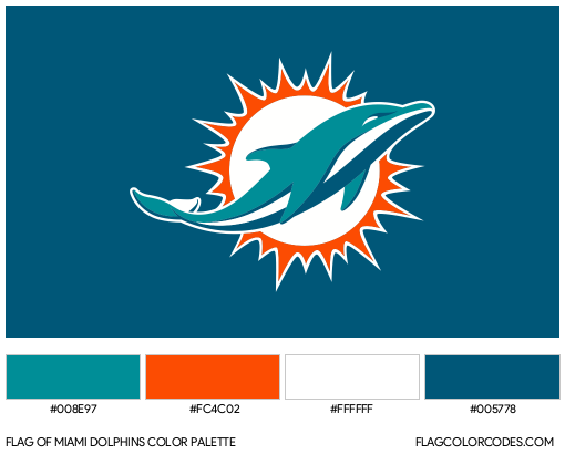
In the early years of the franchise, white served as a prominent secondary color, often appearing on home jerseys and as a contrasting element on away uniforms. This clean, classic color provided a neutral backdrop that allowed the vibrant aqua and orange to pop. It offered a sense of crispness and tradition.
However, as the team’s history progressed, a darker hue began to be incorporated: navy blue. The introduction of navy offered a more sophisticated and grounded contrast to the brighter aqua and orange. It added a sense of depth and seriousness to the uniform designs, often appearing as accents, numbers, or even as the primary color for alternate uniforms. Navy provided a strong visual anchor, making the aqua and orange pop even more intensely. This inclusion of navy allowed for more versatile design options and reflected a desire for a more modern and robust team aesthetic. The balance between the bright tropical colors and the grounding navy has been a key element in maintaining the team’s visual appeal across different eras.
The Throwback Appeal: Revisiting the Classics
One of the most celebrated aspects of the Miami Dolphins’ uniform history is the return to their iconic “throwback” uniforms. These designs, often worn for special “throwback games,” pay homage to the team’s Super Bowl-winning eras of the 1970s. The classic throwbacks typically feature a more pronounced use of aqua, often as the base color of the jersey, with orange accents and numbers. The helmets of this era are particularly memorable, featuring a white shell with an aqua stripe down the middle and the iconic dolphin logo.
The popularity of these throwbacks speaks to the enduring appeal of the original color scheme and the strong emotional connection fans have to the team’s golden age. They represent a purer, unadulterated vision of the Miami Dolphins, a reminder of the team’s foundational identity. The return to these classic designs is not just a sartorial choice; it’s a connection to the team’s heritage and a celebration of its most storied moments.
Beyond the Uniforms: Colors in Miami’s Identity
The colors of the Miami Dolphins are not confined to the football field. They have permeated the broader visual identity of the city and its culture, becoming synonymous with the unique spirit of Miami.
A Symbol of South Florida Culture
The choice of aqua and orange was a prescient one, tapping into the very essence of what makes South Florida so appealing. The aqua reflects the breathtaking beaches and the vibrant marine life, while the orange captures the intense sunsets and the energetic, passionate lifestyle of the region. This connection has made the colors more than just a team’s branding; they are a shorthand for a tropical, sun-kissed, and lively atmosphere. Whether you see these colors on a fan’s jersey, a local business’s signage, or even in the context of other South Florida sports teams that have adopted similar palettes, they evoke a sense of place and a distinct cultural identity.
The Dolphin Logo: A Masterpiece of Color and Design
The Miami Dolphins logo itself is a testament to the effective use of these colors. The original logo, created by Dan Reiss, featured a leaping dolphin in aqua with an orange sunburst behind it, all set against a white background. The dolphin, depicted in mid-air, embodies grace, agility, and speed, perfectly mirroring the team’s aspirations. The orange sunburst adds a dynamic energy, reinforcing the connection to the tropical environment. The evolution of the logo over the years has refined its aesthetic, but the core elements – the aqua dolphin and the orange sunburst – have remained remarkably consistent, underscoring their importance. The logo is an iconic representation of the team, instantly recognizable and imbued with the spirit of Miami.
A Legacy of Vibrancy and Pride
The aqua and orange of the Miami Dolphins have stood the test of time, evolving but never losing their core appeal. These colors represent a fusion of natural beauty and human passion, a reflection of the city they call home. They evoke memories of legendary games, iconic players, and the unwavering loyalty of a dedicated fanbase. From the sun-drenched stadiums of Miami Gardens to the living rooms of fans across the globe, these colors continue to inspire pride, excitement, and a deep-seated connection to one of the NFL’s most storied franchises. The palette of the Miami Dolphins is, in essence, a celebration of Miami itself.
LifeOutOfTheBox is a participant in the Amazon Services LLC Associates Program, an affiliate advertising program designed to provide a means for sites to earn advertising fees by advertising and linking to Amazon.com. Amazon, the Amazon logo, AmazonSupply, and the AmazonSupply logo are trademarks of Amazon.com, Inc. or its affiliates. As an Amazon Associate we earn affiliate commissions from qualifying purchases.